More Than Words: Multi-Language Web Design, UI & SEO Tips That Work
55% of customers prefer shopping in their native language - and translating his blog alone boosted marketer Neil Patel's traffic by 47%. Here's how to design a site that gets it right.
A multi-language site can be one of the best growth levers your e-commerce business has - but only if it's designed right from day one. Here's what that actually takes.
Design for Text That Grows (or Shrinks)
When a visitor switches language, the site should look and feel the same: colors, fonts, structure, logos. Compare these two regional Acer sites, one Hungarian and one Romanian: 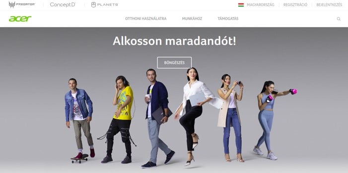
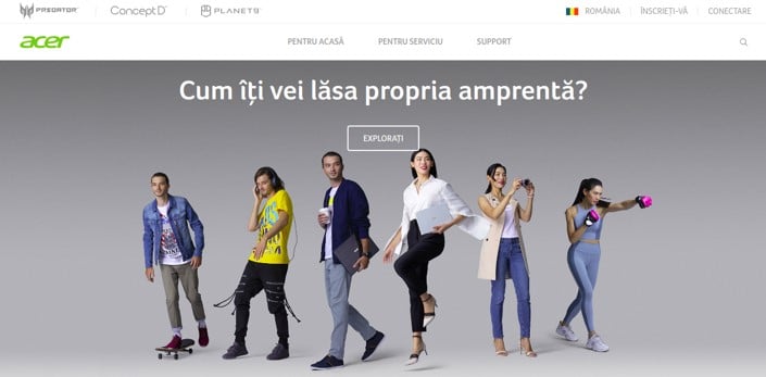
The catch: translated text rarely matches your English character count. This is the expansion and contraction factor, and it's the top cause of broken multilingual layouts - clipped buttons, wrapped nav items, overflowing headlines.
| Language | vs. English | Common failure |
|---|---|---|
| German | ~+30% longer | Clipped buttons, wrapped nav labels |
| Finnish | ~-30% shorter | Awkward, empty-looking buttons |
| Russian, Polish | ~+15-25% longer | CTA text overflows fixed containers |
| Chinese, Japanese | ~-30-50% shorter | Disproportionate line-height/spacing |
Design your components to absorb these swings - a different language also means a different culture, covered next.
One Domain or Several?
There are two approaches to different language versions of a site:
- Several regional domains: yourcompany.fr, yourcompany.de, etc.
- Different pages on the same domain: yourcompany.com/it
Which one you should choose depends a lot on the size of your company. Startups usually need to accumulate authority for their SEO, and save resources at the same time. If you are a young company, a single website is better. First, because your SEO authority will apply to all separate language versions. Second, because you’ll just need to pay for one hosting account. For a large, mature company, having regional domains can help branding. The key challenge here is choosing a fast hosting provider for each site. Otherwise, you risk some regional websites being slower than others, affecting user experience.
Whichever structure you pick, don't skip hreflang tags. These are small pieces of code (<link rel="alternate" hreflang="es" href="..." />) that tell Google which language and regional variant of a page to show a given searcher, and which one to treat as the default (x-default) when no match is found. Get hreflang wrong - mismatched pairs, missing return tags, pointing at a redirect instead of the live URL - and Google may show a Spanish visitor your English page, or flag your translated pages as duplicate content instead of localized ones.
Once the structure is right, getting found is less about hashtags or keyword-stuffing and more about matching intent: write for the phrases people actually search in each language, add subtitled video where you can, and engage locally, in-language. That compounds faster than any tag.
Localize, Don't Just Translate
There's a difference between translation and localization. When you localize a multi-language website, you go beyond the words. You try to adapt the site to the cultural preferences of another country. This includes:
- Image choice: avoid pictures that can offend - for example, people in a conservative country won't like seeing a picture of a girl wearing a bikini.
- Technicalities: calendar, time and date format, addresses, first and last names, etc.
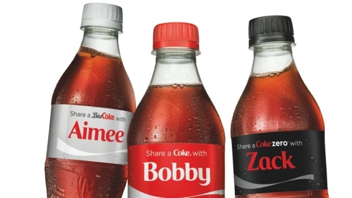
- Word choice: when Coca-Cola launched its Share a Coke campaign, it used first names from 100+ different countries. But in the Chinese version, popular nicknames were used instead, because there are too many first names in Chinese.
- Encoding: your site should correctly display all the special characters used by your target language.
Designing for RTL Scripts
Arabic and Hebrew read right to left, so a F-pattern layout needs to mirror - not just the text, but icons, nav order, forms, and carousels too. A "translated" RTL page that still looks backward isn't actually localized.
| Needs to mirror | Modern CSS fix |
|---|---|
| Margins, padding, alignment | Logical properties (margin-inline-start, padding-block) - flip automatically, no separate stylesheet |
| Button/label width | Flexbox/Grid auto-flow (flex-wrap, grid-template-columns: repeat(auto-fit, minmax(...))) reflows instead of clipping |
| Font size vs. text density | Fluid typography (clamp(), container queries) keeps density consistent per locale |
| Icons, nav, progress bars | dir="rtl" alone only flips text - mirror components explicitly and test the whole library in RTL |
Bake this into your components once, rather than patching pages after a translation breaks them.
Design an Intuitive Language Switcher
Finding the language switcher shouldn’t be a quest. It should be intuitive, obvious, and quick. Visitors are used to finding it in the top right corner, so place it there. Here’s a good example from TransferWise:  When you click on EN, the full list opens:
 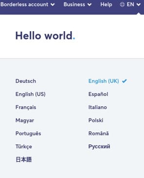 Note that the list includes full language names, not just abbreviations like IT and FR. Plus, they are written each in its own language, for example, Magyar and not Hungarian. This is easier for users who aren’t too comfortable with English. What about flags, though? Some sites use flag icons instead of language names to make the design more minimalist. Here’s what it looks like:
  If you have only 2 or 3 languages on your site, then flags are ok. Still, it is advised to avoid flags, for 2 reasons: 1) Some flags are very similar, for example, Croatia and the Netherlands. Your visitors can get confused. 2) A flag refers to a country, and one country can have several languages (India, for example).
Which Language Should You Show by Default?
Just because someone is viewing your site from Japan doesn’t mean they speak Japanese. People travel and move all the time. So their IP address or the language of their browser won’t tell you which language your users prefer. Many companies will serve a regional version of the site based on the user’s location. Big brands like Uber, Nike, Pepsi, Microsoft, etc. all do this. It’s OK to show a regional site first, as long as you remember that some users will want to switch the language at once. Unfortunately, businesses often don’t realize this. For example, anyone who visits the Microsoft website from Italy will see this: 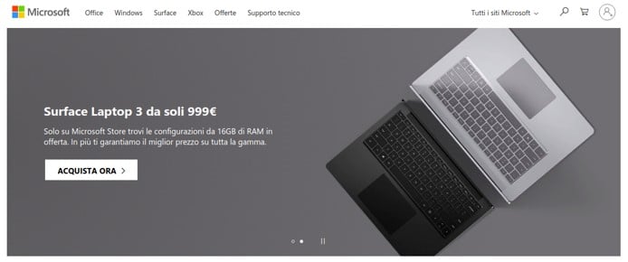 To switch to English, the poor visitor needs to scroll all the way down to the footer. The switcher is at the very bottom, next to the privacy policy and sitemap.
  The rule from Tip no. 4 also applies here. If you decide to show a regional version based on the location, make your language switcher very obvious. Perhaps the best thing to do is to store the visitor’s last chosen language using a cookie.
Give Translators Context, Not Just Text
All too often, a client sends the translator an Excel file with all the site's text in it - CTAs, buttons, error messages, captions, all lumped together, out of context. Here's an example: the icon and number are baked into an image, so the bulk file would only show the phrase 'employees in total'. 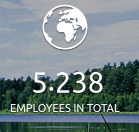 How should one interpret that without seeing the picture? Many languages have cases, too - in Russian, '8000 employees' changes the word itself, not just the number. Give translators links to the live site (and dashboard access, if that needs translating too), not just a spreadsheet.
Scaling with AI + Human Review
For high-volume content, a hybrid pipeline - enterprise AI translation engines and context-aware LLMs for the first pass, MTPE (Machine Translation Post-Editing) for the review - can scale to hundreds of pages at a fraction of the cost of translating everything by hand. But raw AI output still mishandles idioms, legal terms, and cultural nuance, so it should never go live unedited. Reserve full human translation for your highest-visibility pages (homepage, checkout, legal), and route the long tail through AI + MTPE, with an editor checking every line either way. That's the workflow BeTranslated builds around.
Ready to Go Multilingual?
A multi-language site touches your URL structure, your CSS, your CMS workflow, and your SEO markup as much as it touches your copy - which is why it's a cross-functional project, not just a translation job.
BeTranslated works with web and product teams on exactly this. Get a free, no-obligation quote and tell us which markets you're targeting.
Related: International SEO · WordPress Multilingual Architecture · RTL Web Accessibility